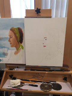
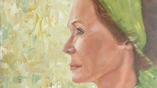
"Painting Linda" 20x16 oil on linen panel
Please click the YouTube link below and select fullscreen.
https://youtu.be/15E7z3_ekCI
It's a one minute start to finish journey of my struggles with this painting.
I’m going to bare my soul on this one. How does the saying
go? “The best laid plans of mice and men?” I’m not a trained artist although I’ve some great mentors and have taken a couple of classes. I have just enough
information to make myself dangerous!
I’ve
always wanted to do a portrait and really get into the detail that would
include among others, value changes, skin tones, eye, nose and mouth detail
etc. I had a great photo of Linda
that I took when we were in Hawaii a couple of years back. I thought it would
be a fun project and a great learning experience. The photo was of Linda on Sunset
Beach, nearing sunset with a rather turbulent ocean in the background. With
that in mind, I set off to compose the painting. I placed Linda’s torso off a
bit to the right leaving room for what I had hoped to be an interesting but not
overpowering background. I didn’t want to compete with the subject.
Now,
there are other issues with this painting and I’m aware of some of them. Let me
say that I also see some major strengths and that I’m not discouraged. Rather,
I’m more determined that ever to see the problems, learn how to solve them and move on! It’s a continuous learning process. I remember when I
first started painting about eight years ago; I would not let myself get
discouraged. I was comparing myself to some of the best. I would complete a
painting and it would be a total wreck. Rather than beating myself up too much,
I would say to my self, find one square inch that’s good. Or one brilliant paint
stroke and focus on that!!! Pretty soon it evolved from one square inch to two and so on and so on….

Ah,
but I digress!!! So, I composed the painting based upon the subject and the
background I had chosen. After everything was in place, I did a rough painting
on another canvas to see if the palette worked and the spacing was correct. In
my inexperienced head, I thought it was fine. My goal was to make it soft and
edgeless except in a few spots where I wanted the eye to head focus on. I started as
you will see with the eyes, mouth and nose locations to get my bearings. All
was going well as her face developed nicely. After I was far enough along, I
decided to take a break from the face and move to the background. THAT is when
the trouble began or at least I thought so at the time. Looking back, I might
have been able to make it work but I got impatient. NEVER get impatient when you're painting! It's for recipe for disaster. In my head, once I started
the background, the lines between the subject and the background would blend so
that you wouldn’t see a defined spot where one mass began and the other ended.
Well,
in a nutshell, it wasn’t working for me. I got too detailed in the sky, clouds
and ocean. They really competed with the subject. So, I toned it down a
bit. Something was still wrong but I couldn’t put my finger on it. It could
have been a poor choice of background to begin with but more likely,
inexperience as to how to tie it all in and make it work.
I
decided to just remove the not so gentle Pacific Ocean! (Whoa! Think about
that!) That space between the torso and the left side of the canvas was now
blank and I just blended the blue. OK, so now I’ve got a real composition
issue. What in the heck am I going to do with the left side of this canvas? At
this point, the painting will have at least one major flaw and that would be
composition, which is fatal for the most part. That said, I had too many hours
into this painting to scrape it all together!
I contacted my good friend Victoria
Gillerion for some advice. She helped me see a few things and I made some
subtle changes but I still couldn’t solve the negative space problem.
One
of the secrets of a good painting is to see to it that the colors of the
palette can be found throughout the painting and not just confined to one area.
This brings uniformity to the work. I had to get skin tones into the headband,
hair and of course the background. Hints of all colors all places. I took several colors that I found in the skin tones, headband and hair and made a huge pot of paint. I then took my pallete knife and dipped into different colors and began slapping paint on the canvas. I really like the effect! The background was awesome as far as I was concerned BUT, it really didn't work that well with the subject. Why? It looks like two paintings to me, not to mention the composition error as a result of changing the background. It appears to be a well-done face/torso painted in one style “placed” on a well-done background painted in a different style. Why does it appear that way? I think it’s a colossal collision of the two styles, and a lack of knowledge as to how to blend the two, ending up with defined edges that separate the subject from the background.

I took several colors that I found in the skin tones, headband and hair and made a huge pot of paint. I then took my pallete knife and dipped into different colors and began slapping paint on the canvas. I really like the effect! The background was awesome as far as I was concerned BUT, it really didn't work that well with the subject. Why? It looks like two paintings to me, not to mention the composition error as a result of changing the background. It appears to be a well-done face/torso painted in one style “placed” on a well-done background painted in a different style. Why does it appear that way? I think it’s a colossal collision of the two styles, and a lack of knowledge as to how to blend the two, ending up with defined edges that separate the subject from the background.
For now, the painting will remain as is. It is quite the journey and the more I know, the more I find there is to know... it's a never ending quest!
Update! March 24, 2016
I'm not a trained artist. I have learned thru some study (certainly not enough) but mostly a lot of trial and error. I recognize when things aren't right. Where I get stuck is how "right it." I knew the painting was unbalanced but wasn't sure what to do. I consulted with my good friend C.w. Mundy. We discussed the painting. Just as I suggested earlier, there were two major issues. First was a clash of styles. Secondly, the balance issue.
To solve the first issue, C.w. suggested that I take the palette knife to the face! Well that scared the heck out of me immediately. I do like the way it's painted, BUT it can't work with that background. Taking the palette knife and altering the style will significantly change the style to more of an impressionistic painting IF I can do it successfully. Major challenge there!!!
The second issue is balance. C.w. sent me a drawing of how tI might solve the balance issue.
|


